
Artist profile
Piet Parra
Dutch artist Parra (1976) is best known for his surreal bird-like characters and distinctive use of saturated colours. His early work explored vibrant hand-drawn letters and humor, in recent years, his work has evolved into gorgeously layered abstract interpretations of his core figures.
Celebrated by galleries and championed by a devout underground following, Parra has become a respected and multimedia artist, through solo exhibitions spanning Asia, the United States, and Europe. Working across large scale public sculpture, painting, drawing and textile work, Parra creates an enigmatic and instantly recognisable style that defies easy categorisation. His work is in the public collection of the San Francisco Museum of Modern Art.
Parra is co-founder of cult apparel label ByParra and a member of music group Le Le and MICH. Parra Lives and works in Amsterdam, The Netherlands.

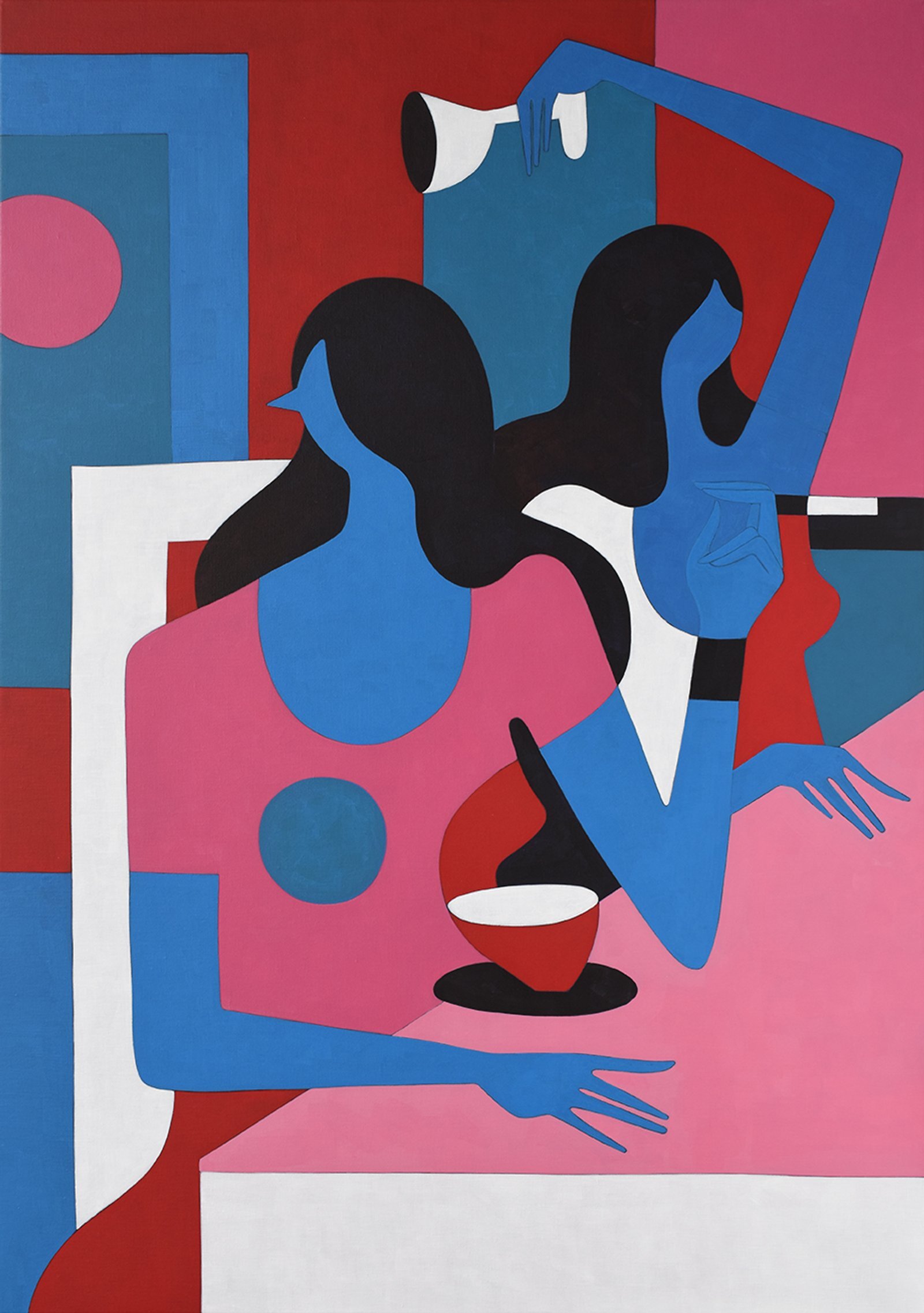


Dutch artist Parra has a very unique identity. His imagery often depicts surreal character caught up in scenes of mischievous and scandalous acts. Crossing the boundaries from drawing, painting, animation and sculpture his visual aesthetic resonates throughout each medium through the graphic style of his characters to his vibrant and restricted colour palette. Although his rise to fame came quickly within a couple of years he has worked with major brands including Nike, Vans and Converse, and has now branched out creating his own clothing brand, Rockwell.


An unintentional artist Parra came from a skateboarding background, and his design work merely stemming from doing poster and flyer designs. After the pro skateboarding career didn’t work out he got more and more commissions for his work and his career blew up from there. Commenting on the beak-like faces his characters embody he says the style was already within him and something that came so naturally; and maybe this explains his success. His work has the honesty of someone that knows what they want to portray and strict visuals that don’t need to be questioned.

“I like the poppy colors, like the oranges, blues, and pinks. This is the palette that makes me happy. From the clothing I put on, I’m very happy with these restrictions, and simplicity. I hardly use yellow but I did it for the Nike jacket because it worked so well together. I’ll break the rules sometimes because they’re my own.”
“When I was doing the flyers, I got into that hand-drawn style. My father was a painter, an artist, and he used to say draw one line and if it’s no good, do it again. The style came to me fairly quickly. It felt like it was always inside of me. Those beaked people actually came from not being able to draw a face. When I did draw a face, it was too real-looking. It looked like a specific person, almost referential. I was trying to do something long lasting, like a character, a cartoon. Instead of working on the face, the eyes to show emotion, it’s both harder and easier this way.”

“I don’t put paper in front of my nose. I listen to music, watch some TV, take a walk. It takes a long time for ideas to take shape. Taking a blank piece of paper every day and sitting there… it’s not going to happen. I need to get an influence from the outside world. Ideas are like dreams, and they come to me sometimes when I sleep—it happens quite a lot.”
Website: www.workbyparra.com
Instagram: @pietparra